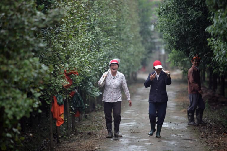
Ginko farm workers walk down path. China. 2007 Image by World Bank Photo Collection.
Finding an Image that Fits
One of the joyful challenges of producing On Being is infusing every aspect of our work — from the hugely consequential to the seemingly trivial — with thoughtfulness to match the ideas we encounter every day. Last week, we sat down to find a lead image to accompany Krista’s conversation with Mike Rose on mentorship and education, the overlooked value of manual labor, and the ongoing shift in how we evaluate the worth and depth of a vocation. The image represents our presence in an array of online spaces — on our website and mobile apps (displaying on screens from 27-inch retina displays to 3-inch smartphones); in On Being‘s social media feeds on Facebook, Twitter, and Instagram; and in podcast players like iTunes, SoundCloud, and Stitcher.
Like a book cover, it needs to represent the conversation in a visually and emotionally compelling way, while also representing the editorial scope of the production.
We always approach this exercise with a number of questions in mind:
- How do we visually represent these abstract concepts in a complex and layered way?
- Which images embody the essence of our present conversation, and help us contemplate these subjects more deeply?
- How can we spark people’s curiosity, and draw them into the conversation as listeners and thinkers?
At the same time, as producers, we need to consider a few, less romantic aspects of each photo:
- Does the image have a high enough resolution to look crisp and clear on larger displays?
- Does it have an interesting depth of field?
- Is the photo framed well? Is its composition interesting?
- Are the colors vivid and contrasted enough to render well on our website and mobile apps?
It’s with a long and particular list of criteria that we dive into our search, striving to balance the worlds of aesthetic elegance and symbolic depth — a delicate (and not entirely scientific!) task.
We surfaced with a wide selection of fantastic photos. Of course, most of them became runners-up to the photo we ultimately chose. But that didn’t mean they weren’t beautiful or compelling — just a better fit, perhaps, for contexts still to come.

With this episode’s focus on labor, we naturally gravitated to images of people at work. We liked this photograph of German road workers and the photo of women working in a gingko farm in China (at the beginning of this post), all finding space in their work for joy and laughter. Photos of laborers so often show them in a state of exhaustion or boredom, but images like these have so much more energy and life. They humanize their subjects and bring a degree of familiarity and warmth that is so often absent in photojournalistic choices. Despite their aesthetic and emotional beauty, they might do better foregrounding a discussion about finding joy in one’s vocation.

The idea of manual labor so often connotes masculinity. This archival image of a female riveter during World War II is a great diversion from the usual tropes. We were drawn in by its aura of quiet focus and the reveal of the the woman’s face reflected by the plane’s skin, which makes the scene feel unexpectedly intimate and contemplative. But, this photo hearkens back to yesteryear, to a different age that risked feeling too removed. This was another instance where the quality and aesthetic of the image drove us to decide against it — the shadows, low contrast, and graininess didn’t stand out sharply enough against the design of our website and mobile apps.

As with the image of the WWII riveter, we loved this photograph for many reasons, one being its subject is a woman: a Darfuri bead artist. The close focus on her hands and handiwork leads us to consider the artistry of her craft, and the particular attention that she must pay to remember patterns — undoubtedly something she practiced and learned over many years, and an art form that most of us would struggle with. It was a close call, but ultimately we decided against this photograph because of the focus on the object rather than on the individual performing the craft.

We rarely use heavily manipulated photos, but this image was so eye-catching — and so well executed! — that we had to take note of it. It seems to speak to the often repetitive nature of manual labor, but in a way that suggests resilient focus, attention, and care, rather than mind-numbing monotony. The contrast between the light and shadows in the image also creates a sense of intimacy. You almost feel as if you’re in the room with this man, watching him closely as he works. But, again, we found that the photo was a bit too dark to be particularly striking on a web page.


We decided against these two images for similar reasons — a black-and-white photo isn’t quite immediately arresting enough to serve as the cover image for an episode. But the quiet pensiveness of the young boy as he rests from his wood splitting hearkens back to Mike Rose’s ideas about the thoughtfulness involved in manual labor. In the second photo, the empty gloves and the handle of the woodworking tool on the table make one wonder about the hands — and the human — missing from the scene. Whose hands are usually present in this place? What do they do here? What’s their craft? In the end, we were hesitant to use an image that lacked a human subject, when the conversation with Mike Rose was so centered on the unique value of the individual.


Interestingly, we found ourselves very drawn to images of welders. Even though we conducted our searches individually, we each came back with a handful of welding photos in our collections. We find the warmth, brightness, movement, and vivid color somewhat hypnotizing; and we’re fascinated by the tension in such a brutal, almost violent act being performed in such a focused and precise way. Additionally, the first photo depicts an apprentice welder being trained — an apt reflection of the educational focus of Mike Rose’s work.

Finally, after much discussion, we emerged with a winner.
This photo contained a bit of everything we were after. It’s vividly contrasted, in sharp focus, and beautifully composed: the blue in the intricate ribbon of smoke; the bright yellow of the welder’s safety vest; all of it stands out strongly against the photo’s dark backdrop. It also has that air of silent thoughtfulness and focus that we were drawn to in so many of the photos we considered. Certainly visually arresting enough to pique our — and our audience’s! — curiosity and attention.
Take a look at it as the lead image on the episode page, and as the podcast cover image in the SoundCloud player below. If you haven’t yet had the chance, take some time to listen to the conversation.
Share your reflection