Visual Brand Guide
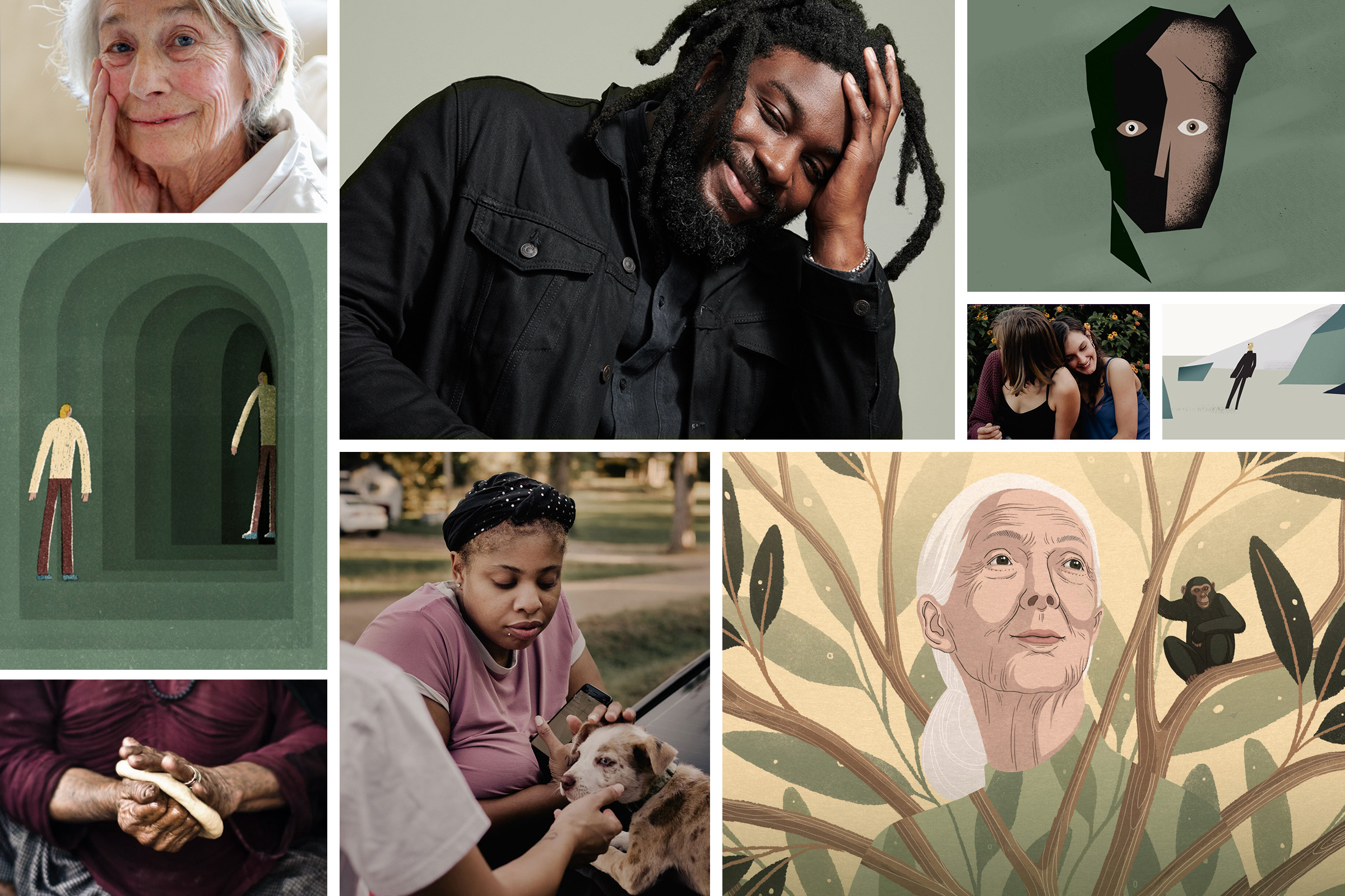
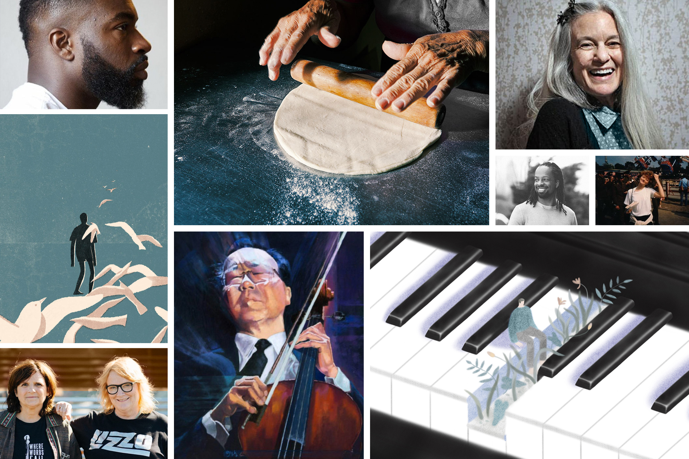
Our illustration style is intentionally expansive, and welcomes perspectives from many artists and life experiences. To create cohesion across styles, our direction is guided by the following principles: subtle texture, balance, warmth, standard application of our color palette, and most importantly, human forms with human-focused subject matter.
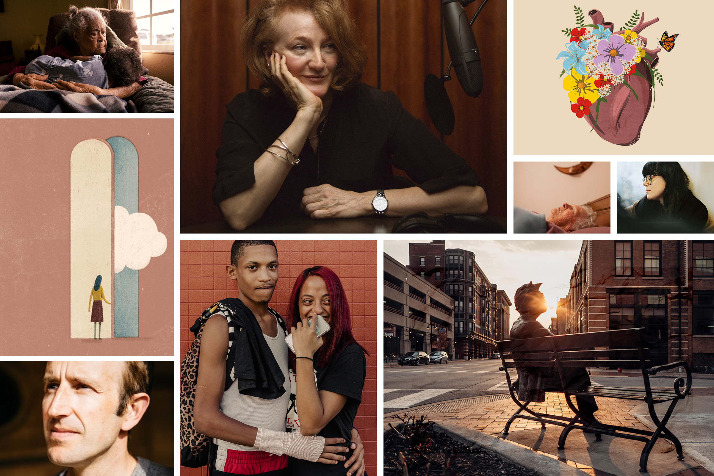
We uphold a photographic style that empowers all humans. We embrace diversity of every kind, and aim to showcase a multitude of humanity. Stylistically, our photography uses soft lighting, compositions, and captures intimate moments that draw you in. Saturated color and focus play help to communicate the overall soft feeling. Intimate and refined portraiture creates desired emphasis on the interview or guest. We aim to capture joyful, complex, tender, and real-life moments through a unique lens.
When using found images from stock websites or Google, we follow the same principles of our illustration and photographic guidelines to ensure visual alignment with our brand.
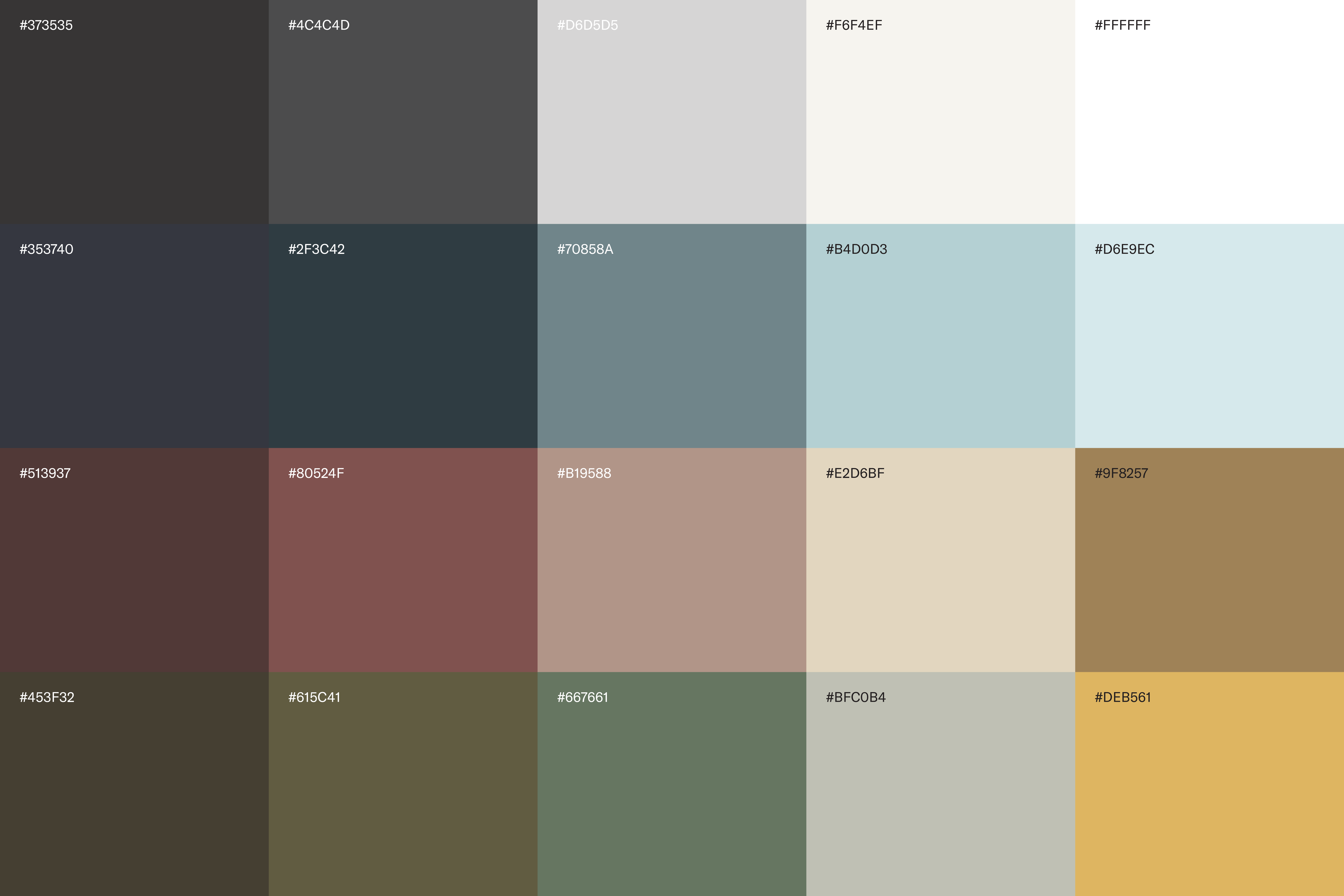
An earthy, rich palette brings the personality of our brand to life. Our palette allows for variety and dynamism through its many possible combinations. Any color combination can be used, with intention. All colors and tones can be used across different touch points, but the primary colors are black, white, and tones of blue.
Thank you for spending time with these guidelines. We are hopeful that they provide clarity around the artistic choices we make that contribute to the visual representation of our brand.
Search results for “”
View
- List View
- Standard View
- Grid View
Filters